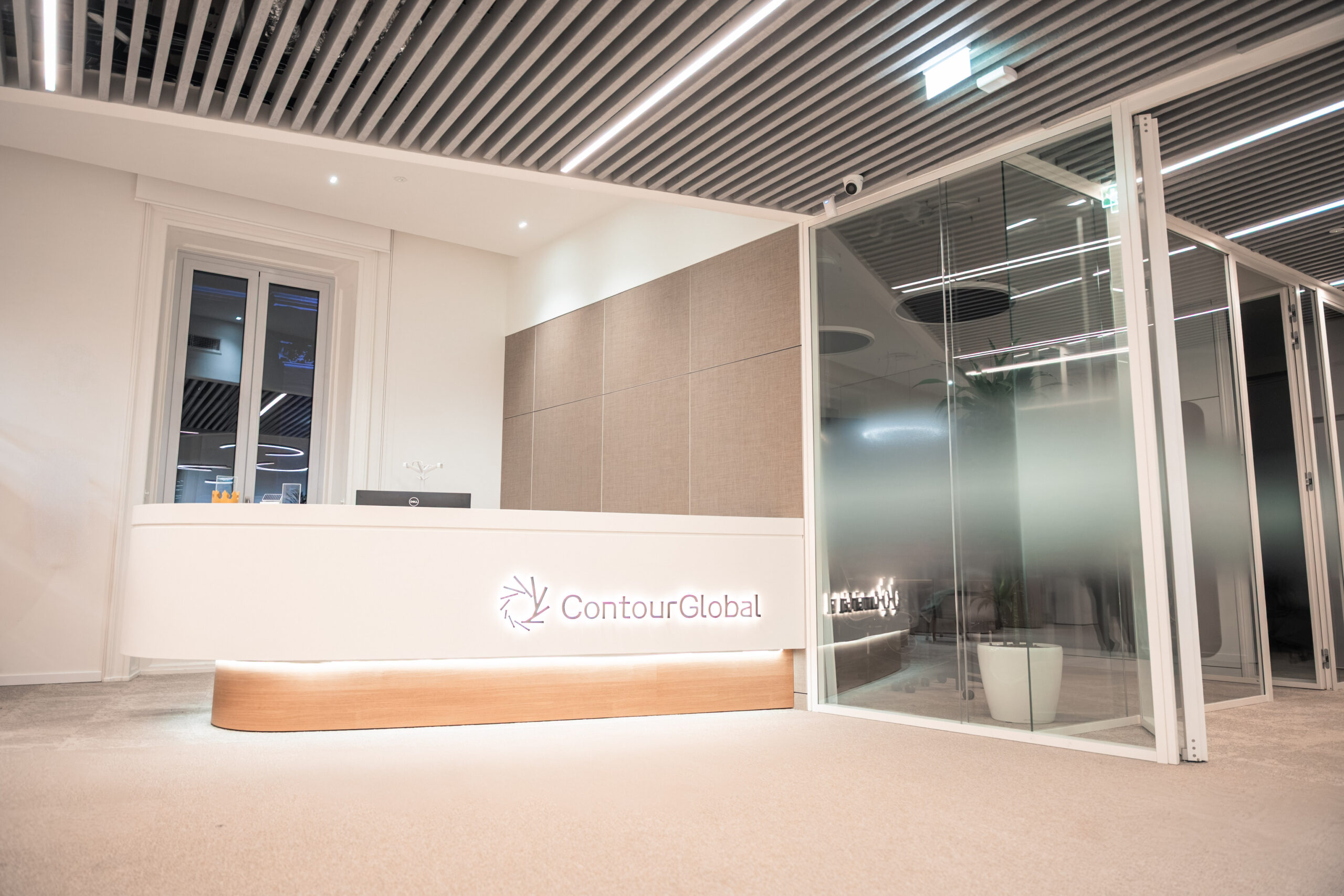
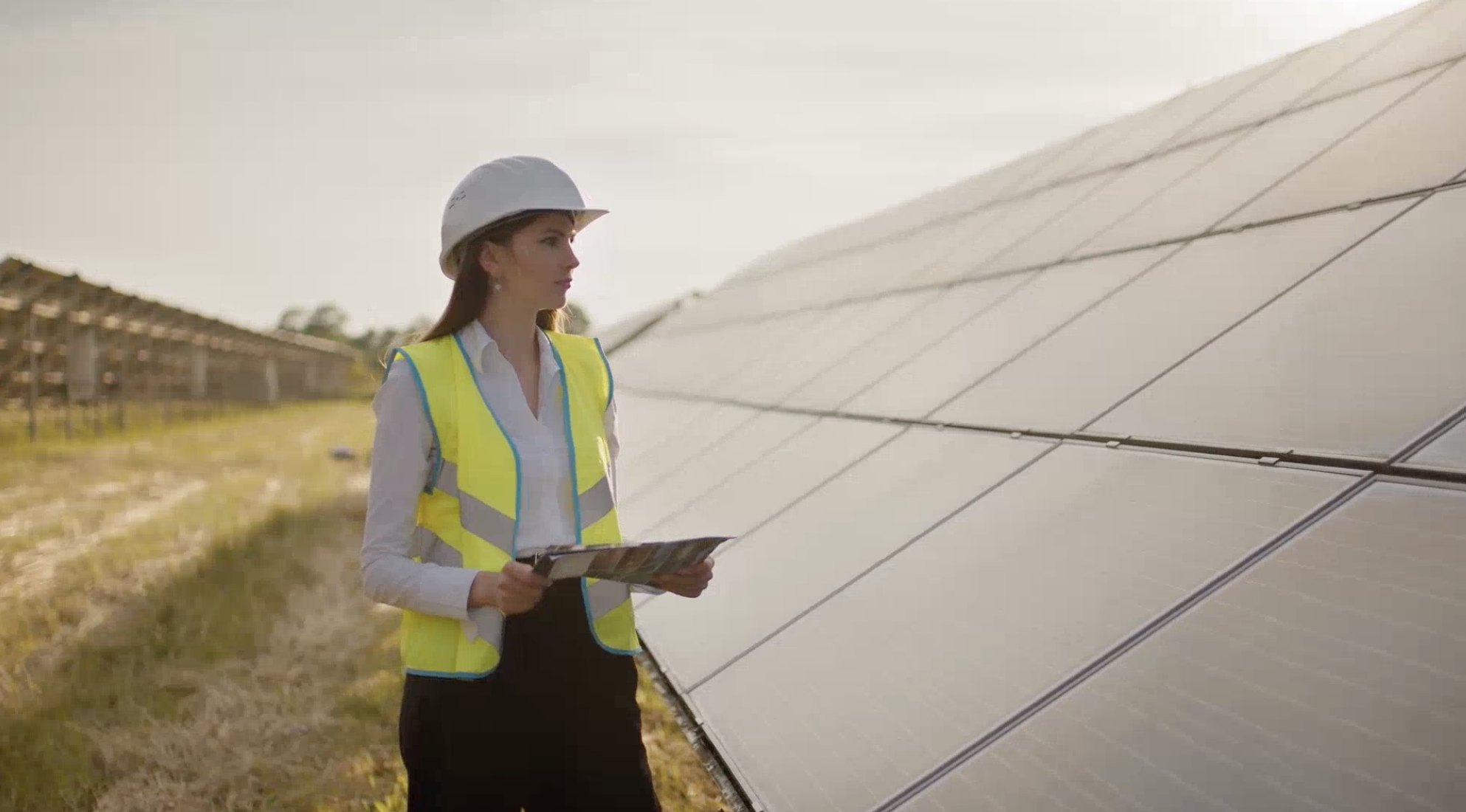
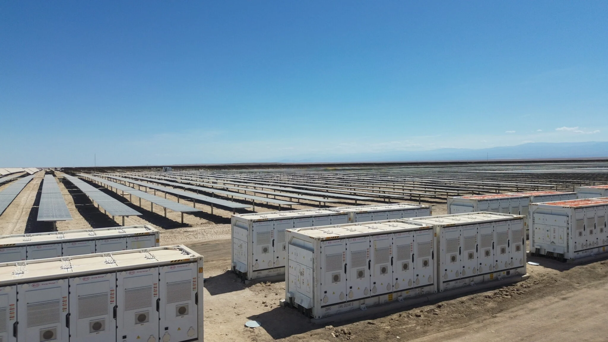
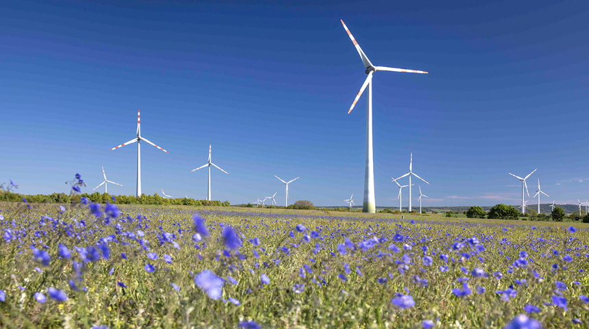
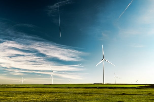
A new geometry of energy
Our visual language combines two souls: the flexible flow of energy and the structured logic of technology. Grids and lines organise complexity into clear forms, turning systems, assets and data into layouts that are easier to read, navigate and manage.
The visual explorations were enriched by thorough research into the evolution of artistic and cultural visual languages across the historical periods marked by past energy transitions. The major shifts, from coal to oil, and from fossil fuels to renewables, have long inspired progress and social change. The new identity celebrates precisely this: the power of energy as a creative force and a driver of transformation.
The grid gives structure; motion shows how things change. Transitions, reveals and animations are used sparingly to highlight relationships, priorities and states inside complex energy systems, helping people understand information faster and with less effort.
Our icon language reflects what ContourGlobal stands for: clarity, reliability and respect for the people and places we serve. A shared visual vocabulary across all our markets builds trust and helps turn complex energy topics into clear, actionable information.
Brand colors
Our brand colors are designed to feel clear, calm and purposeful. The palette takes its cues from the world of energy, deep, reliable tones for infrastructure and systems; brighter accents for innovation, people and progress.